Choosing Typography That Holds Up at Every Size
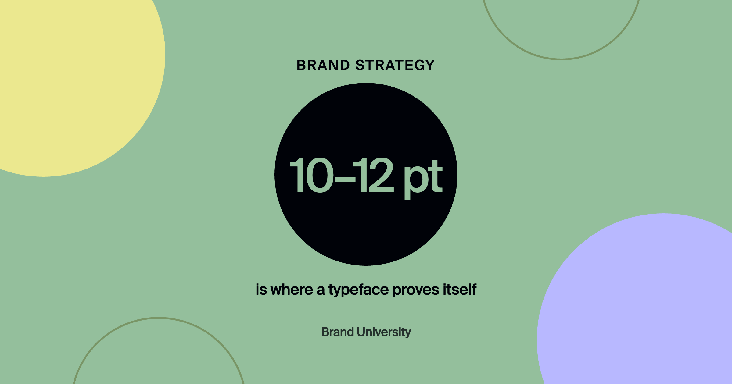


The short answer: test a typeface at 10 to 12 points before falling for it at headline size, choose families with a full range of weights, confirm web and desktop licensing the client can actually use, and keep the system to two typefaces: one for headlines, one for body.
A typeface that looks striking in a big headline mockup can turn to mud in a footer, on a business card, or in a mobile menu. Typography chosen only at presentation size is one of the most common gaps between a polished pitch and a brand that works in the real world.
Key takeaways
- Small sizes reveal problems big mockups hide.
- A full weight range creates hierarchy without extra fonts.
- Licensing and availability decide whether guidelines get followed.
- Two typefaces cover nearly every brand.
- Test type in real applications, not just specimens.
How do you test whether a typeface works at small sizes?
Set real body copy, captions, and fine print at 10 to 12 points and read them on screen and in print. Delicate serifs, tight letter spacing, and thin strokes often become illegible at the sizes most everyday communication uses.
Why does a typeface need multiple weights?
Because hierarchy comes from contrast. A family with light through bold, plus matching italics, lets a brand create emphasis and structure while staying in one cohesive system. One or two weights forces you to add more typefaces to create hierarchy.
What practical checks should you run before choosing a font?
Confirm web font licensing, availability in the software the client's team uses, and performance on the website. A beautiful typeface the client can't install becomes a guideline everyone ignores within weeks. Heavy web fonts also affect page speed, which matters for both visitors and search. Page Speed Basics covers why.
- Test at 10 to 12 pointsSet real body copy and captions and read them on screen and in print.
- Check the weight rangeLight through bold, plus italics, builds hierarchy in one family.
- Confirm licensing and availabilityWeb licensing and the software the client's team actually uses.
- Check web performanceHeavy web fonts affect page speed.
How many typefaces should a brand use?
Usually two: one for headlines, one for body. Occasionally a third for a specific accent use. More than that and the system fights itself. Consistency across every touchpoint matters more than variety. branded by explains why in brand consistency online.
Typography decisions get easier once the brand can say who it is for. The free positioning statement builder turns what you do, who you do it for, and the result into a statement, a portfolio headline and a LinkedIn headline you can paste today.
Frequently asked questions
Should a brand use a free or paid typeface?
Either can work. Free fonts are easier for clients to use everywhere. Paid fonts can be more distinctive. Check licensing either way.
Is serif or sans serif better for a brand?
Neither is universally better. Choose based on personality, legibility at real sizes, and how it fits the category.
How do I pair two typefaces?
Pair for contrast in structure, like a serif headline with a sans serif body, while keeping similar proportions so they feel related.
Where to go from here
Typography systems are covered inside Brand University. Pair this with Color Psychology, Minus the Pseudoscience, and join Brand University on Skool.
About the author
Evan Barnes is the founder of Brand University and of branded by, a brand-first growth agency based in Greenville, South Carolina. He built Brand University to teach designers the business side of design, from positioning and pricing to running client work, and more than 1,200 designers now learn inside the Brand University community on Skool.