How Many Logo Variations Does a Client Really Need
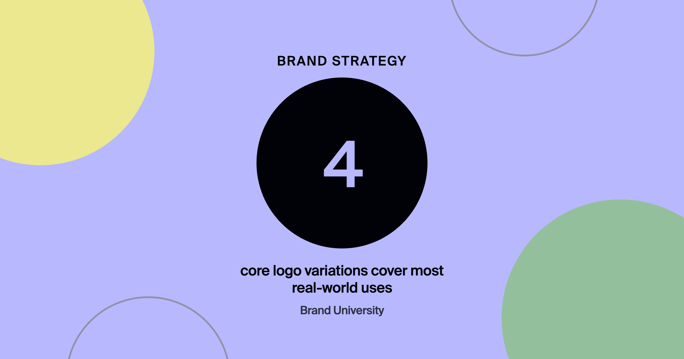

The short answer: most brands need four logo variations: a primary horizontal lockup, a stacked or vertical version, an icon or symbol for small spaces, and a single-color version. Add reversed versions and special formats only when the brand actually needs them, and deliver everything in clearly named folders with usage guidance.
Too few variations and a client squishes the horizontal logo into a square avatar the first week. Too many and nobody knows which of fifteen files to use. The right number is smaller than many designers deliver, but more than one.
Key takeaways
- Four core variations cover most real-world uses.
- Add variations based on actual applications, not habit.
- Clear file naming prevents misuse.
- Show each variation in context in the style guide.
- Provide the right formats for print and web.
What logo variations does every brand need?
- Primary horizontal lockup for websites, headers, and wide spaces.
- Stacked or vertical version for square or tall spaces.
- Icon or symbol for favicons, app icons, and social avatars.
- Single-color version for embroidery, stamps, and one-color printing.
When should you add more logo variations?
When the brand has a real use for them: a reversed version for dark backgrounds, a simplified mark for very small sizes, or special lockups for sub-brands or partnerships. Base additions on actual applications the client will use.
What file formats should logo deliverables include?
Vector files like SVG, EPS, or PDF for print and scaling, and PNG files with transparent backgrounds for everyday digital use. Include color versions in the brand palette plus black and white.
How should logo files be organized?
In clearly named folders by variation and format, like Primary-Horizontal/Color/SVG. A short readme or style guide page showing which version to use where prevents most misuse. Building a Style Guide Clients Will Actually Use covers the guide itself.
What to hand over
| Deliverable | Why |
|---|---|
| Vector files: SVG, EPS or PDF | Print and scaling |
| PNG with a transparent background | Everyday digital use |
| Brand color, black and white versions | Every surface and printing method |
| Clearly named folders | Primary-Horizontal/Color/SVG, so nobody guesses |
| A short readme or guide page | Which version to use where |
Why does using the right variation matter?
Because a logo used inconsistently or distorted weakens recognition every time. Consistent use across every touchpoint is what builds a memorable brand, a point branded by expands on in brand consistency online.
Before you debate logo variations, make sure the brand can state its position in one line. The free positioning statement builder turns what you do, who you do it for, and the result into a statement, a portfolio headline and a LinkedIn headline you can paste today.
Frequently asked questions
What's the difference between a logo and a logo mark?
The logo often combines a symbol and wordmark. The logo mark or icon is the symbol on its own, used where space is limited.
Should logo variations be priced separately?
Most designers include the core set in a logo package and price additional custom lockups separately.
Do I need a favicon version of the logo?
Yes. A simplified icon that stays legible at very small sizes is essential for websites and apps.
Where to go from here
Logo systems are covered inside Brand University, including the How to Design a Logo When You Have No Ideas workshop. See the logo design post, and join Brand University on Skool.
About the author
Evan Barnes is the founder of Brand University and of branded by, a brand-first growth agency based in Greenville, South Carolina. He built Brand University to teach designers the business side of design, from positioning and pricing to running client work, and more than 1,200 designers now learn inside the Brand University community on Skool.