Accessibility Isn't Optional: A Practical Starting Point


The short answer: a handful of habits covers most of what matters: use strong text contrast, write real alt text for meaningful images, make every interactive element reachable and visible with a keyboard, pair color with text or icons to convey meaning, and label every form field. Build these into every project by default instead of retrofitting them later.
Accessibility often gets treated as a specialist topic for enterprise projects. In practice, a few design habits make sites usable for far more people, improve SEO, and reduce legal risk, and they cost almost nothing once they're part of your process.
Key takeaways
- Contrast is the easiest and most common win.
- Alt text describes images for people who can't see them.
- Every interactive element needs a visible keyboard focus state.
- Never rely on color alone to communicate meaning.
- Accessible defaults are cheaper than retrofits.
What color contrast do websites need?
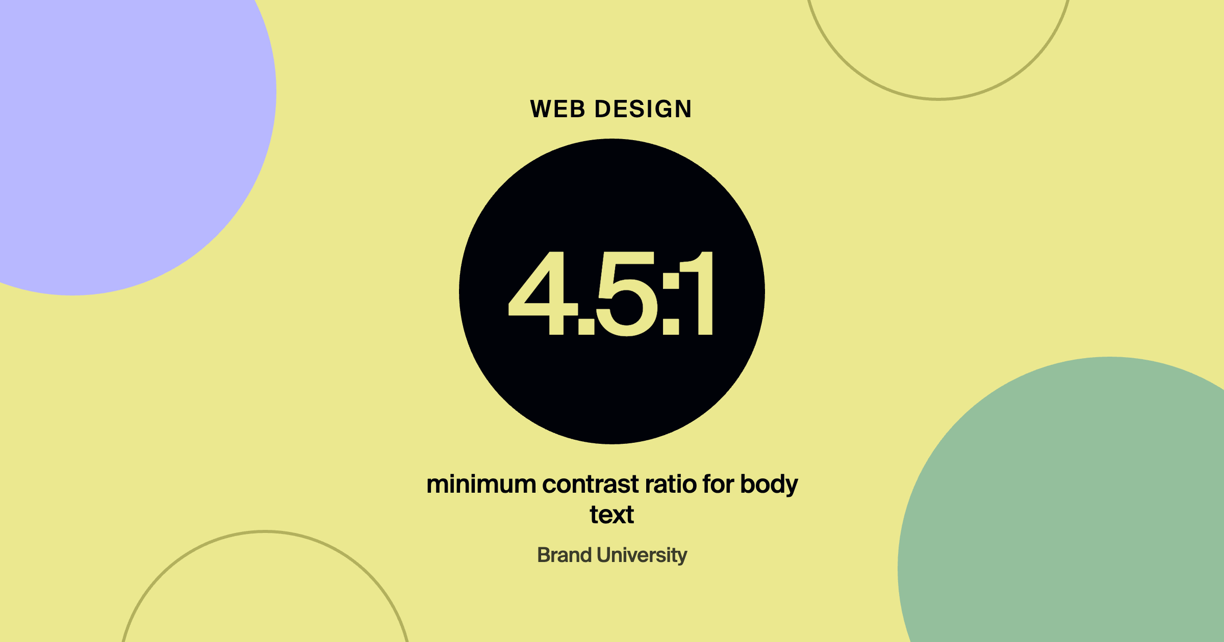
Enough that text is easy to read for people with low vision or in bright sunlight. WCAG guidelines call for a contrast ratio of at least 4.5 to 1 for normal body text and 3 to 1 for large text. Light gray text on white looks elegant in a mockup and fails real visitors. Check contrast with a free tool during design, not after launch.
How should designers write alt text?
Describe what the image communicates in context, briefly. For a team photo: Three designers reviewing logo sketches at a studio table. For a purely decorative flourish, leave alt text empty so screen readers skip it. Avoid stuffing keywords. Good alt text helps screen reader users, and it also helps search engines understand your images.
What is keyboard navigation and why does it matter?
Some visitors navigate entirely with a keyboard, tabbing from link to link. If your design removes the visible focus outline, they can't tell where they are on the page. Keep a clear, on-brand focus style for links, buttons, and form fields, and make sure menus, modals, and sliders can be operated without a mouse.
Why shouldn't color carry meaning on its own?
Because a meaningful share of people have trouble distinguishing certain colors. A form that only turns a field red on error, or a chart that relies only on color, fails them. Add text, icons, or patterns alongside color so the message gets through either way.
- Check contrastDuring design, with a free tool, not after launch.
- Write real alt textDescribe what the image communicates; leave decorative images empty.
- Style focus statesKeyboard users need to see where they are.
- Pair color with text or iconsSo meaning never depends on color alone.
- Label every form fieldAnd keep headings in logical order.
How do you make accessibility a default?
Add it to your standard checklist: contrast checked, alt text written, focus states styled, forms labeled, headings in logical order, links descriptive. branded by folds items like these into its 50-point pre-launch website checklist. Accessible structure also makes pages easier for AI tools to parse, which branded by covers in website experience that wins in AI search.
Frequently asked questions
Is website accessibility legally required?
In many cases, businesses can face legal claims over inaccessible websites, and requirements vary by country and industry. Clients should consult a lawyer for their specific situation, but good accessibility habits reduce risk either way.
Does accessibility help SEO?
Yes. Alt text, logical headings, descriptive links, and clean structure all help search engines understand a page.
What's the fastest way to audit a site for accessibility?
Run an automated checker, then manually tab through the site with a keyboard and review contrast. Automated tools catch many issues but not all of them.
Where to go from here
Accessibility fundamentals are built into the site production process taught inside Brand University. Pair this with Designing Mobile-First Without Losing the Desktop Experience and Forms Are a Conversion Feature, then join Brand University on Skool.
About the author
Warren Coppage is an owner and the Director of Growth at branded by, a brand-first growth agency based in Greenville, South Carolina. He leads advertising and growth for branded by's clients and has managed more than $10 million in ad spend across home service, eCommerce, and other industries. He writes for Brand University about the marketing, web, and sales side of running a design business. Connect with him on LinkedIn or learn alongside him in the Brand University community on Skool.